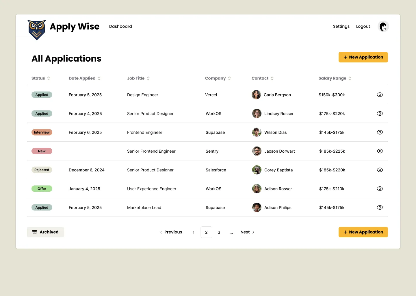
Jobs List
The jobs application list page lists all the jobs that we’ve applied for. For this tutorial, it will also serve as the Dashboard.
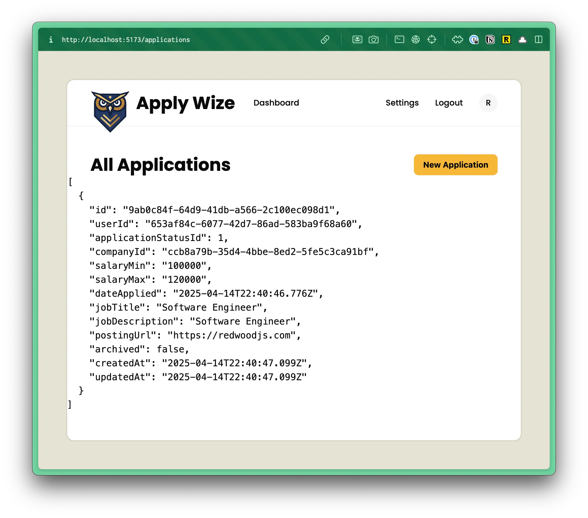
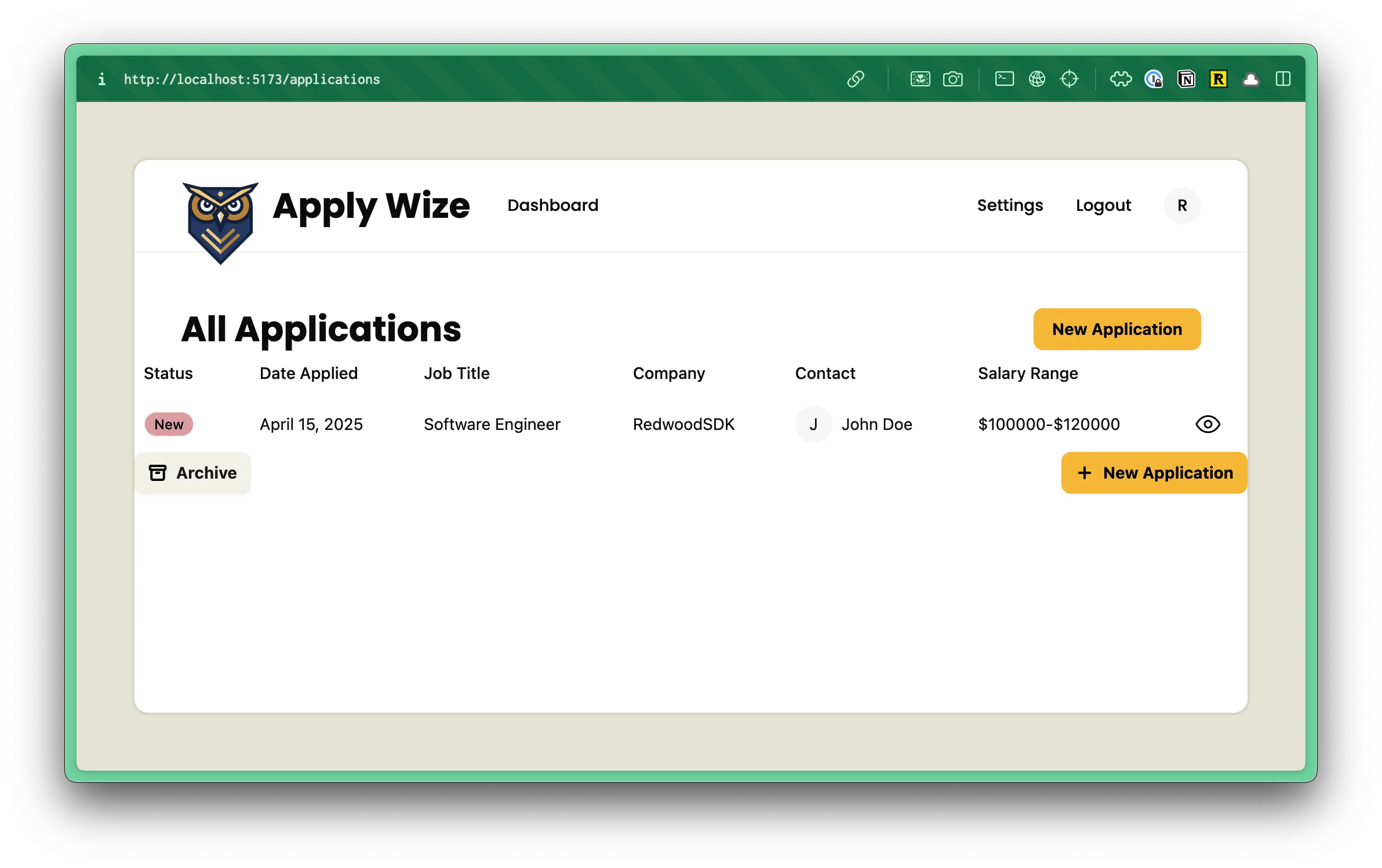
The finished page will look like this:
Let’s start with the backend code and then make it look good.
But, first, we need a page and a route.
In the src > app > pages directory, create a new folder called applications. Inside, create a file called List.tsx.
Directorysrc/
Directoryapp/
Directorypages/
Directoryapplications/
- List.tsx
Directoryuser/
- …
- Home.tsx
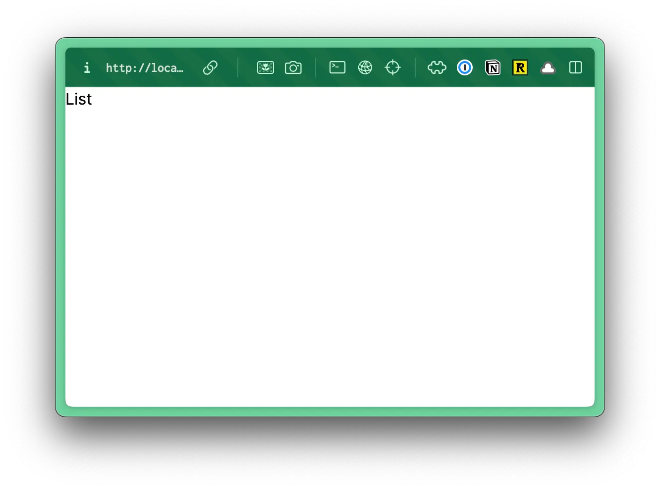
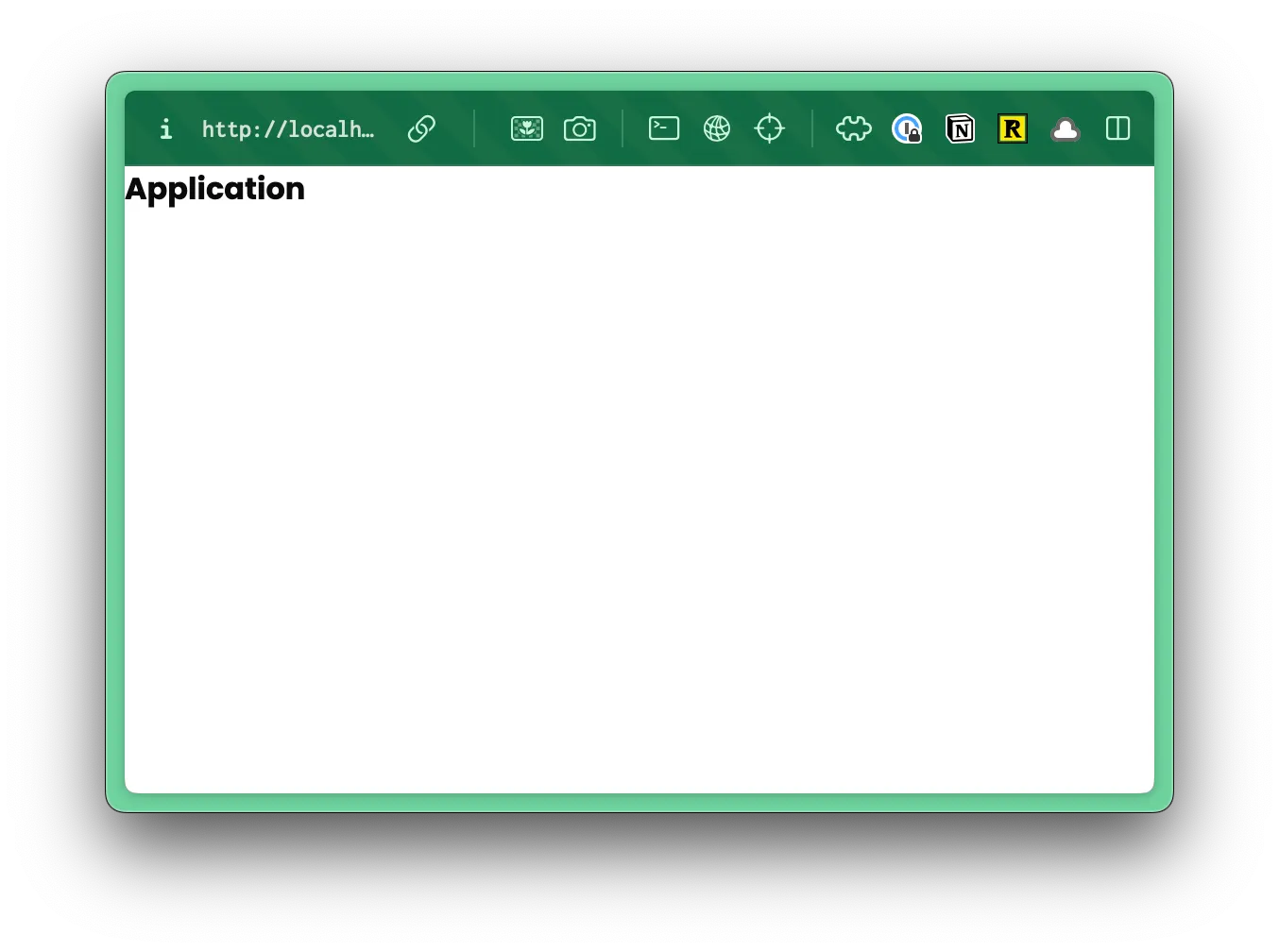
We can stub out a basic page, just to make sure it’s loading correctly.
const List = () => { return ( <div>List</div> )}
export { List }Now, within our worker.tsx file, we can add a route for our new page.
import { List } from "./app/pages/applications/List";...prefix("/applications", [route("/", List)]),- We'll group all of our application routes (List, New, Detail, Update) under the
/applicationsprefix. - When the user visits
/applications, they'll see ourListcomponent.
Let’s test this out in the browser. Go to http://localhost:5173/applications and you should see our stubbed out page.
Since we’ve already set up authentication, we can also protect this route.
prefix("/applications", [ route("/", [ ({ ctx }) => { if (!ctx.user) { return new Response(null, { status: 302, headers: { Location: "/user/login" }, }); } }, List]),])This would get cumbersome (and annoying) if we have to do this for every.single.route we wanted to protect. Let’s abstract this code into a reusable function. Right below our AppContext type, let’s add a new function:
const isAuthenticated = ({ ctx }: { ctx: AppContext}) => { if (!ctx.user) { return new Response(null, { status: 302, headers: { Location: "/user/login" }, }); }}We're passing in the ctx that we automatically get with each request. Then, we're checking to see if the user exists on the context object. If it doesn't, we're returning a response that redirects the user to the login page.
Then, we can update our /applications prefix to use isAuthenticated:
prefix("/applications", [isAuthenticated, route("/", List)]),Now, not only is our /applications route protected, but any route prefixed with `/application” is protected, too.
While we’re cleaning up our worker.tsx file, let’s update the / and /protected routes:
route("/", () => new Response("Hello, World!")),route("/protected", [route("/", [ ({ ctx }) => { if (!ctx.user) { return new Response(null, { status: 302, headers: { Location: "/user/login" }, }); } }, isAuthenticated, Home,]),- First, we can delete the existing home page
/route. - Then we can change the path for the
/protectedroute to/. - Finally, we can remove our authentication function and use the
isAuthenticatedfunction instead.
The updated code looks much cleaner:
route("/", [isAuthenticated, Home]),I want to take this a step further and show you another option. With the homepage route, you can also use the index function. This works very similar to the route function, but it assumes the path is /, so it only takes one argument: the response.
route("/", [isAuthenticated, Home]),index([ isAuthenticated, Home ]),Be sure to import index at the top of the file:
import { route, render, prefix, index } from "rwsdk/router";Test it out. 👨🍳 Chef’s kiss! If you’re logged in, you should see the “List” text. If you’re not logged in, you’ll be redirected to the login page.
Now, let’s get some data into the database.
We can do this one of two ways:
Option 1: Create a Seed File
Section titled “Option 1: Create a Seed File”Earlier, I mentioned that sometimes I’ll create multiple seed files with various purposes.. This is a perfect opportunity to create a separate file specifically for adding job applications to our database.
Inside the src/scripts directory, create a new file called applicationSeed.ts.
Let’s stub it out:
import { defineScript } from "rwsdk/worker";import { db, setupDb } from "@/db";
export default defineScript(async ({ env }) => { setupDb(env);
console.log("🌱 Finished seeding");});- On line 4, we're setting up the Cloudflare Worker environment to run our script. By default, we get the
envobject. - On line 5, we're setting up our database.
- On line 7, we're logging a message to the console to indicate that the script has finished running.
Inside our function, we can reach for a standard Prisma create function:
const createApplication = async () => { await db.application.create({ data: { salaryMin: "100000", salaryMax: "120000", jobTitle: "Software Engineer", jobDescription: "Software Engineer", postingUrl: "https://redwoodjs.com", dateApplied: new Date(), } })};
await createApplication();- On line 8, we're referencing the
applicationtable. Then, using the Prismacreatefunction to add all the data in our database object. You'll notice that these values match the columns we defined inschema.prismafile.
You’ll probably see a few linting errors.
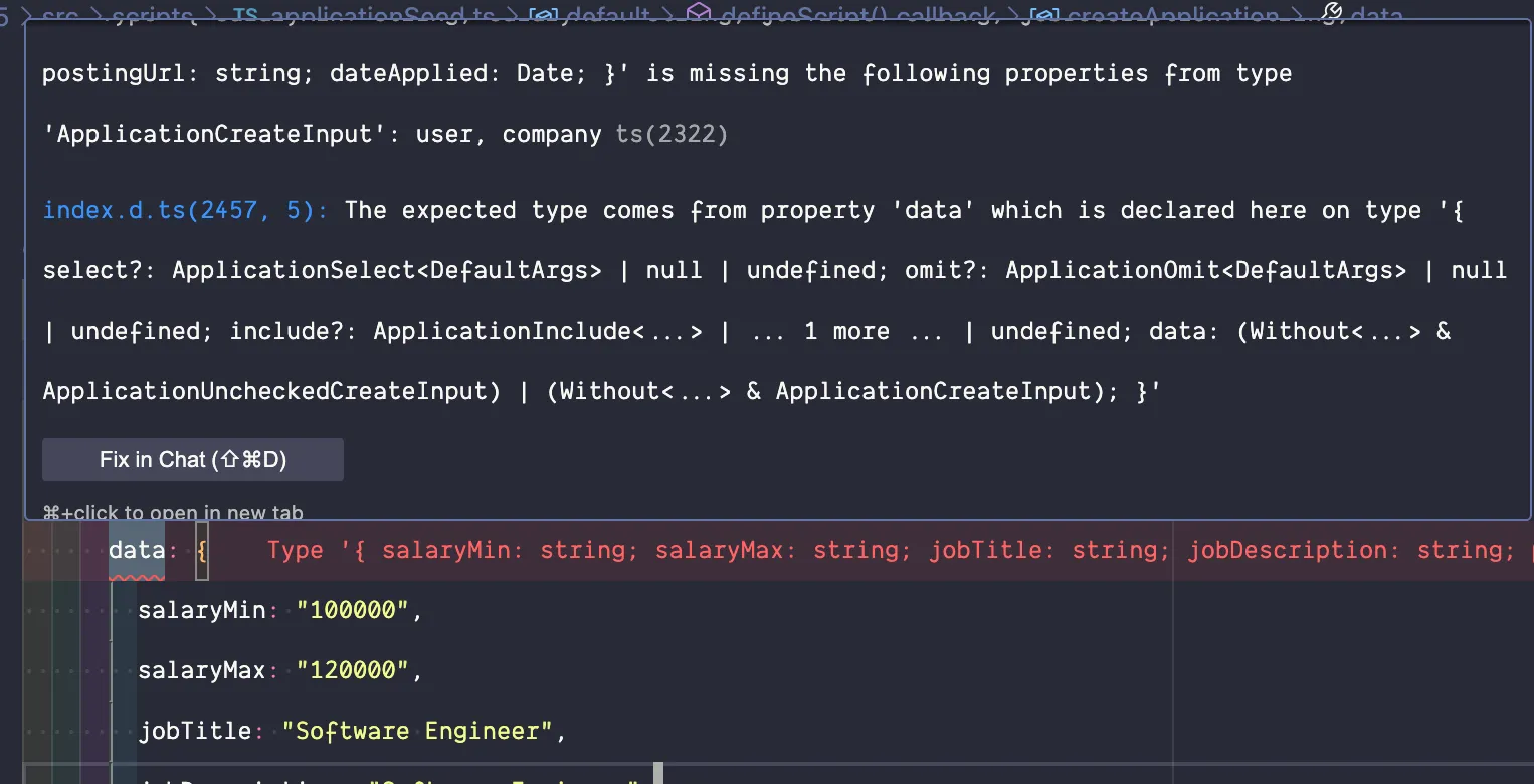
If you run the script now, you’ll hit a few errors because it’s also looking for related user, status, and company entries. For the user and status connections, we already have entries within the database we can reference.
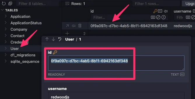
Let’s start with the user connection. If you look at the user table, you’ll see that their ID is 0f9a097c-d7bc-4ab5-8b11-6942163df348. (Obviously, yours will be slightly different.) Copy that value.
Now, we can connect the entries, by setting user to an object with a connect key. Inside, we’ll specify the id of the user we want to connect to.
export default defineScript(async ({ env }) => { setupDb(env);
const createApplication = async () => { await db.application.create({ data: { ... user: { connect: { id: "0f9a097c-d7bc-4ab5-8b11-6942163df348", }, }, ...We want to do something similar for the status. If we look at the ApplicationStatus table, you’ll notice that an id of 1 is associated with a New application.
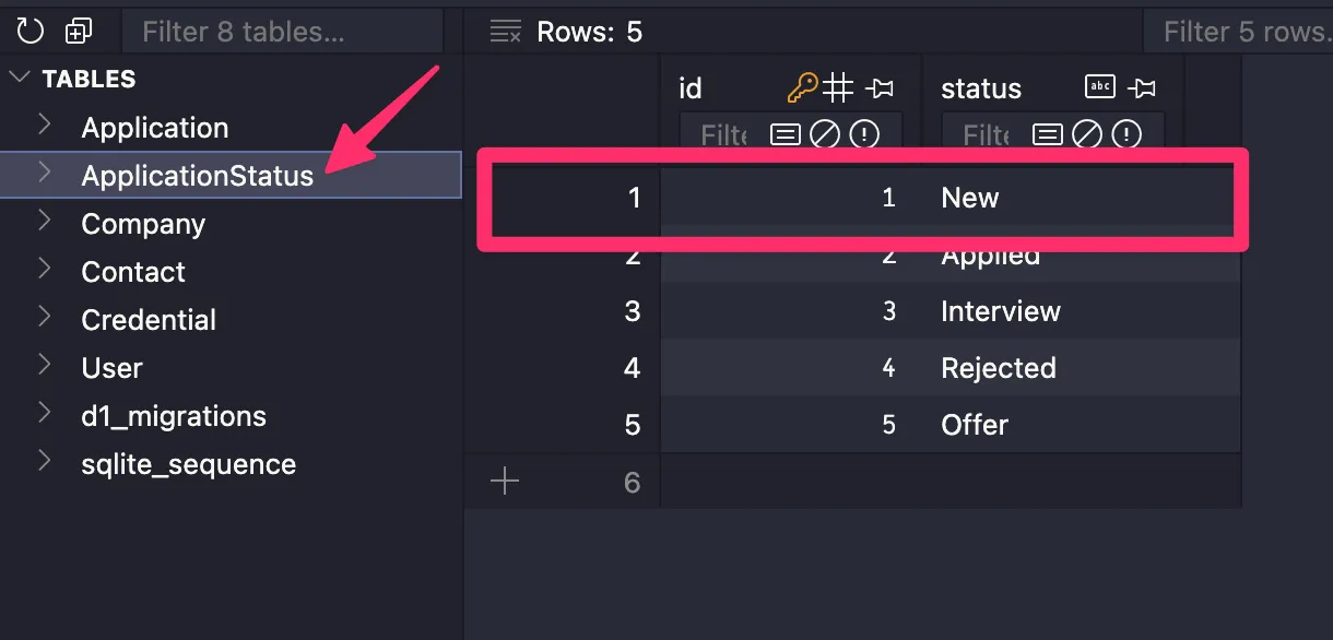
We can connect the application record to the status record, by referencing an object with a connect key that contains an object with an id of 1.
export default defineScript(async ({ env }) => { setupDb(env);
const createApplication = async () => { await db.application.create({ data: { ... status: { connect: { id: 1, }, }, ...The company field is a little different because we haven’t created any company records yet. However, we can create and connect a company record at the same time:
export default defineScript(async ({ env }) => { setupDb(env);
const createApplication = async () => { await db.application.create({ data: { ... company: { create: { name: "RedwoodSDK", contacts: { create: { firstName: "John", lastName: "Doe", email: "john.doe@example.com", role: "Hiring Manager", }, }, }, }, ...This time instead of using an object with a connect key, we’ll use a create key inside. Then, we can list an object with all the company’s data.
Complete applicationSeed.ts file
import { defineScript } from "rwsdk/worker";import { db, setupDb } from "@/db";
export default defineScript(async ({ env }) => { setupDb(env);
const createApplication = async () => { await db.application.create({ data: { salaryMin: "100000", salaryMax: "120000", jobTitle: "Software Engineer", jobDescription: "Software Engineer", postingUrl: "https://redwoodjs.com", dateApplied: new Date(), user: { connect: { id: "d7bfbc91-e869-4041-9980-88da4a749c99", }, }, status: { connect: { id: 1, }, }, company: { create: { name: "RedwoodSDK", contacts: { create: { firstName: "John", lastName: "Doe", email: "john.doe@example.com", role: "Hiring Manager", }, }, }, }, }, }); };
createApplication();
console.log("🌱 Finished seeding");});To run the seed file, within the Terminal:
npm run worker:run ./src/scripts/applicationSeed.tspnpm run worker:run ./src/scripts/applicationSeed.tsyarn run worker:run ./src/scripts/applicationSeed.tsIf this feels hard to remember, you can create a script in your package.json file. Inside the scripts block:
... "scripts": { ... "seed": "pnpm worker:run ./src/scripts/seed.ts", "seed:applications": "pnpm worker:run ./src/scripts/applicationSeed.ts", ... },Now, you can run the seed file by saying:
npm run seed:applicationspnpm run seed:applicationsyarn run seed:applications😅 Much more straight forward!
When you’re creating custom seed files, this does take more time on the frontend to set up. But, it makes it much easier in the long run. Now, anytime you need a fresh set of data, you can run the seed file.
Option 2: Prisma Studio
Section titled “Option 2: Prisma Studio”Another option is to use Prisma Studio. This option is easier, but requires manual entry and can take more time in the long run. (We already set up Prisma Studio, here.)
npx prisma studioPrisma Studio should now be available at http://localhost:5555. From here, you can create, read, update, and delete records.
Displaying the Job Application Data
Section titled “Displaying the Job Application Data”Once you’ve added some data, let’s go back to our application and display the data on the page.
On the Applications list page, let’s import the db at the top of the file. Then, inside the List function, let’s use the findMany function to get all the applications:
import { db } from "@/db";
const List = async () => { const applications = await db.application.findMany();
return ( <div> <pre>{JSON.stringify(applications, null, 2)}</pre> </div> )}
export { List }Notice, we also made our List function an async function. We need to await the database call before rendering the page.
All the data from the database is returned as an array and saved in a variable called applications. Then, we can display all the data by using the JSON.stringify function. Wrapping our code in pre tags, it makes it easier to read.
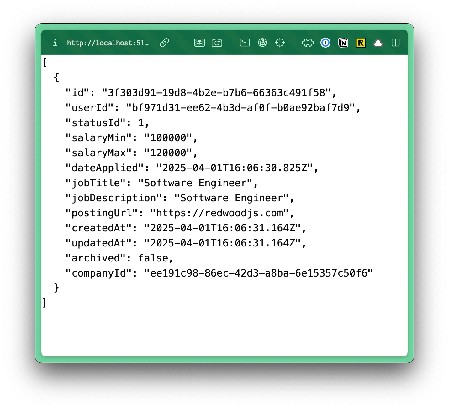
Easy, right?! Since we’re using React Server Components, this code runs on the server. We’re able to make database calls directly from the page and don’t need to worry about creating API routes. 🎉
Also, if you right click on the page and select View Source, you’ll see that the data is being rendered directly on the page.
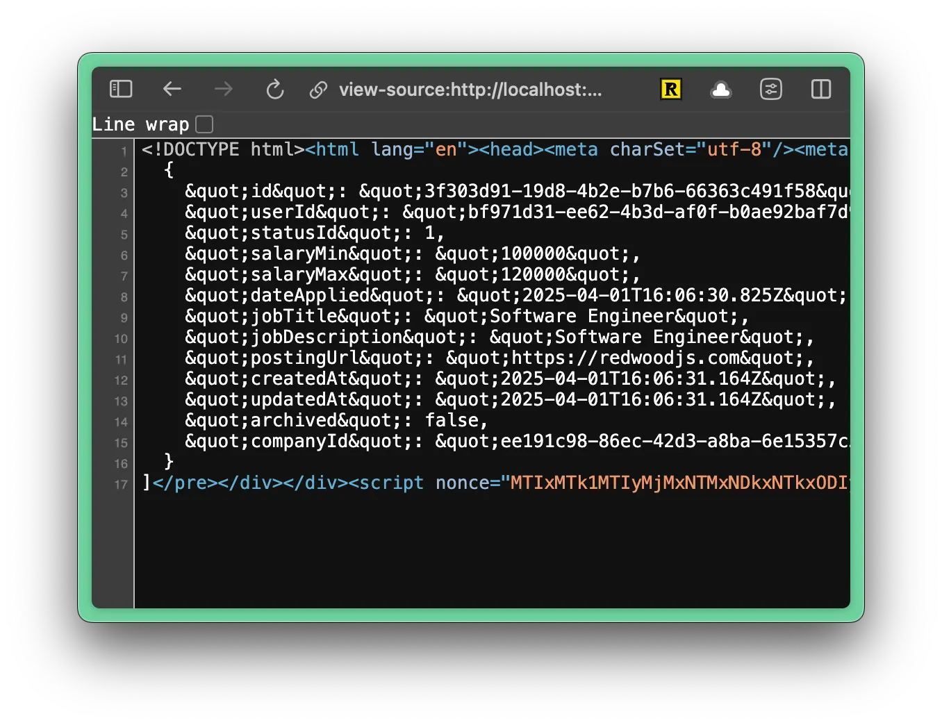
In comparison, if you were you were working with a traditional SPA (Single Page Application), all the data would be rendered on the client side with JavaScript and the View Source might look like this:
<div id="app"></div>Now that we know the content from our database is getting on the page, let’s style it.
Styling the Job Applications List Page
Section titled “Styling the Job Applications List Page”Similar to the auth pages, let’s start by creating a layout that will wrap all of our interior pages.
Creating an Interior Page Layout
Section titled “Creating an Interior Page Layout”Inside our layouts folder, let’s create a new file called InteriorLayout.tsx.
Directorysrc/
Directoryapp/
Directorylayouts/
- AuthLayout.tsx
- InteriorLayout.tsx
Inside, we need should use some of the same styles that we used within our AuthLayout.tsx file. As a quick reminder, let’s take a look at the AuthLayout.tsx file:
const AuthLayout = ({ children }: { children: React.ReactNode }) => { return ( <div className="bg-bg min-h-screen min-w-screen p-12"> <div className="grid grid-cols-2 min-h-[calc(100vh-96px)] rounded-xl border-2 border-[#D6D5C5]"> ...- The wrapping
divsets the background color, the minimum height and width of the page, and adds some padding. - The child
divsets up the grid, applies rounded corners, and adds a border.
We don’t need to set up a grid, but we can abstract the styles and reuse them within our interior layout.
From the AuthLayout.tsx file, I’m going to copy the bg-bg min-h-screen min-w-screen p-12 styles and create a class inside our styles.css file, inside the @layer components block:
.page-wrapper { @apply bg-bg min-h-screen min-w-screen p-12;}Let’s head back to the AuthLayout.tsx file. Then, let’s do something similar with the nested div. We don’t need the grid, but we can grab everything else: min-h-[calc(100vh-96px)] rounded-xl border-2 border-[#D6D5C5]. Now, let’s create new class, called .page right below the .page-wrapper class:
.page { @apply min-h-[calc(100vh-96px)] rounded-xl border-2 border-[#D6D5C5];}Let’s also add our route to our links.ts file for type hinting:
import { defineLinks } from "rwsdk/router";
export const link = defineLinks([6 collapsed lines
"/", "/user/login", "/user/signup", "/user/logout", "/legal/privacy", "/legal/terms", "/applications",]);Now, we can update the classes within our AuthLayout.tsx file:
const AuthLayout = ({ children }: { children: React.ReactNode }) => { return ( <div className="page-wrapper"> <div className="grid grid-cols-2 page"> ...Now, let’s jump over to our InteriorLayout.tsx file and use these classes there as well:
import { type LayoutProps } from "rwsdk/router";
const InteriorLayout = ({ children }: LayoutProps) => { return ( <div className="page-wrapper"> <div className="page bg-white">{children}</div> </div> );};
export { InteriorLayout };You'll notice I also added a background of white with bg-white
To see how this looks, let’s wrap our application prefix within the worker.tsx file:
layout( InteriorLayout, prefix("/applications", [isAuthenticated, route("/", List)])),
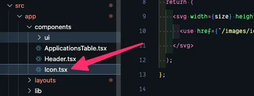
It’s coming together! Across the top, let’s add the logo and navigation. We may need to reuse this component in the future, so let’s make it it’s own component. Inside the components folder, let’s create a new file called Header.tsx.
Directorysrc/
Directoryapp/
Directorycomponents/
- Header.tsx
const Header = () => { return ( <header> {/* left side */} <div></div>
{/* right side */} <div></div> </header> )}
export { Header };Here are the basic building blocks we need.
- On lines 3 and 9, I used a semantic HTML element
headerto wrap everything. - Then, we'll have a left and right side. On the left, we'll display the logo and the navigation. On the right, we'll display a link the user's settings, the logout button, and the user's avatar.
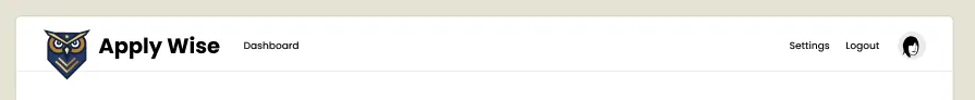
Inside the left div, let’s add the logo and “Apply Wize” text and wrap it in a link:
{/* left side */}<div> <a href={link("/")}> <img src="/images/logo.svg" alt="Apply Wize" /> <span>Apply Wize</span> </a></div>- Pretty straightforward. We’re using the same
logo.svgthat we used on the auth pages. It should already be in yourpublic/imagesfolder. - Then, we’re using the
linkhelper to link to home page. At the top of your file, you’ll need to import thelinkhelper:
import { link } from "../shared/links"Now, let’s add the navigation. For now this is only one link that goes to the dashboard page.
{/* left side */}<div>4 collapsed lines
<a href={link("/")}> <img src="/images/logo.svg" alt="Apply Wize" /> <span>Apply Wize</span> </a> <nav> <ul> <li><a href={link("/applications")}>Dashboard</a></li> </ul> </nav></div>For the right side, we want another unordered list and the Avatar component:
{/* right side */}<div><nav> <ul> <li><a href="#">Settings</a></li> <li><a href={link("/user/logout")}>Logout</a></li> <li> <Avatar> <AvatarFallback>R</AvatarFallback> </Avatar> </li> </ul></nav></div>- Notice, I replaced the right side
divwith anavelement, keeping things nice and semantic. - Inside, I’ve included links for the settings and logout pages.
- For the
Avatarcomponent, you’ll need to import it at the top of your file. This is a shadcn/ui component, so it should already be part of your project.
import { Avatar, AvatarFallback } from './ui/avatar'Normally, when you’re using the Avatar component, you’ll also want to use the AvatarImage component. This is where you define the Avatar image:
import { Avatar, AvatarFallback, AvatarImage } from '@/app/components/ui/avatar'
...
<li>  <Avatar>    <AvatarFallback>R</AvatarFallback>    <AvatarImage src="./images/avatar.png" />  </Avatar></li>
If you want to go this route, you can download the avatar.png placeholder image and hard code the image source. However, we’re not going to cover file uploads and storage in this tutorial. So, we’ll use the AvatarFallback component to display the first character of the username.
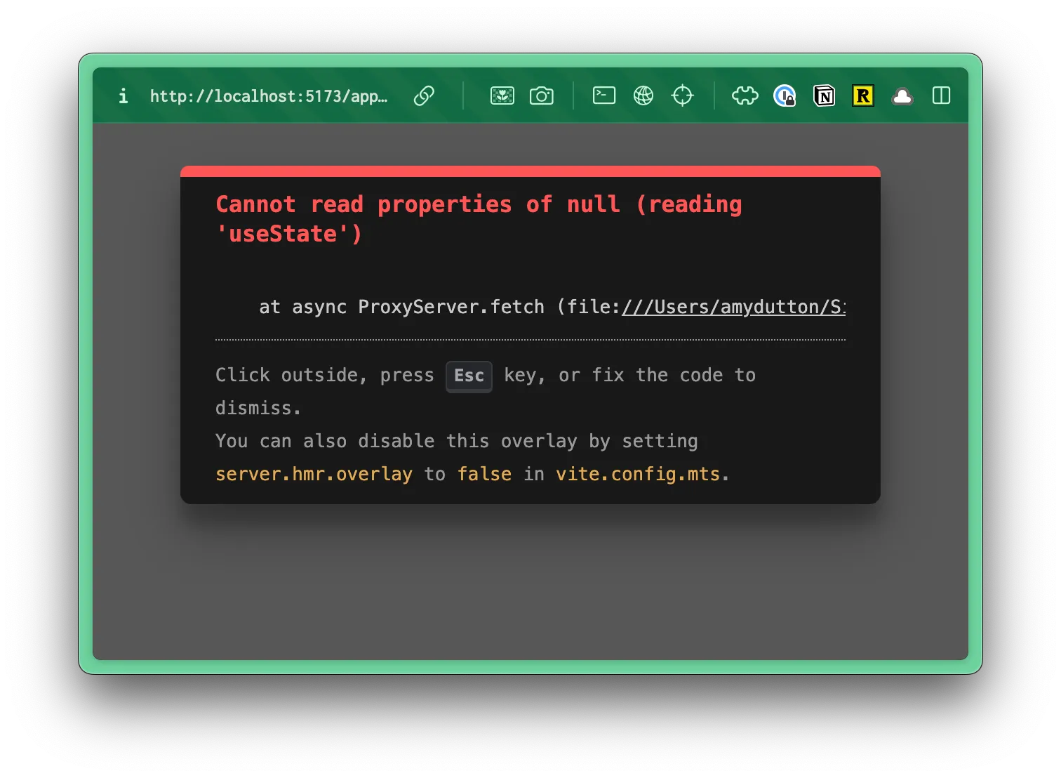
The shadcn/ui Avatar component uses client side interactivity. So, you’ll need to add the use client directive to the top of the Avatar.tsx file:
"use client"
import * as React from "react"import * as AvatarPrimitive from "@radix-ui/react-avatar"
import { cn } from "@/app/lib/utils"
function Avatar({ ...If you forget to add the use client directive, you’ll see a “null reading useState” error in the browser:
Now that we have all the elements, let’s add some styling:
<header className="py-5 px-10 h-20 flex justify-between items-center border-b-1 border-border mb-12">py-5adds20pxof padding to the top and bottom.px-10adds40pxof padding to the left and right.h-20sets the height to80px.flexandjustify-betweenare used to align the items inside the header, putting as much space between each of the elements as possible.items-centercenters the items vertically.border-borderandborder-b-1adds a border to the bottom of the header with a color ofborder(defined as a custom color in the@themeblock of ourstyles.cssfile).mb-12adds48pxof margin to the bottom of the header.
We set the left and right padding to 40px with px-10. We’ll use this throughout our entire application. In order to maintain consistency, let’s define it as a custom utility. This will make it easy to reference (and change, if necessary).
@theme {16 collapsed lines
--font-display: "Poppins", sans-serif; --font-body: "Inter", sans-serif;
--color-bg: #e4e3d4; --color-border: #eeeef0;
--color-primary: #f7b736; --color-secondary: #f1f1e8; --color-destructive: #ef533f;
--color-tag-applied: #b1c7c0; --color-tag-interview: #da9b7c; --color-tag-new: #db9a9f; --color-tag-rejected: #e4e3d4; --color-tag-offer: #aae198;
--spacing-page-side: 40px;}Inside the @theme block, below our color definitions, we'll add a new variable called --spacing-page-side and set it to 40px. Now, we can use this variable with margin or padding: mx-page-side or px-page-side respectively.
Update the header element to use the new utility, replacing px-10 with px-page-side:
<header className="py-5 px-10 px-page-side h-20 flex justify-between items-center border-b-1 border-border mb-12">On the left side div, we want the logo and the Dashboard link to align vertically:
{/* left side */}<div className="flex items-center gap-8">9 collapsed lines
<a href={link("/")}> <img src="/images/logo.svg" alt="Apply Wize" /> <span>Apply Wize</span> </a> <nav> <ul> <li><a href={link("/applications")}>Dashboard</a></li> </ul> </nav></div>- We're using
flexanditems-centerto align the items vertically. gap-8adds32pxof space between the logo and the Dashboard link.
On the home page link, we want the logo and the “Apply Wize” text to align vertically too:
<a href={link("/")} className="flex items-center gap-3 font-display font-bold text-3xl">flex,items-center, andgap-3aligns the logo and text and puts12pxof space between them.font-displayandfont-boldare used to style the text, applying the font Poppins and making the text bold.text-3xlsets the font size to30px
If you look at the logo, it overlaps with the bottom border of the header.
In order to achieve this, we also need to add some styles to the img tag:
<img src="/images/logo.svg" alt="Apply Wize" className="pt-5 -mb-3" />pt-5adds20pxof padding to the top.-mb-3removes12pxof margin from the bottom and will make the bottom of the header shift up.
For the right side ul, we need to add a few styles to position the links properly:
{/* right side */}<nav> <ul className="flex items-center gap-7"> ...- Similar to techniques we've used before, we're using
flexanditems-centerto align the items vertically. gap-7adds28pxof space between each of the links.
To style our nav links, I want these styles to apply to both the left and the right side. So, let’s stick these inside the styles.css file, inside the @layer base block:
@layer base {17 collapsed lines
* { @apply border-border outline-ring/50; } body { @apply bg-background text-foreground; }
h1, h2, h3 { @apply font-display font-bold; }
input[type="text"] { @apply border-border border-1 rounded-md px-3 h-9 block w-full mb-2 text-base; }
nav { @apply font-display font-medium text-sm; }}That should be it! (for the header at least)
Finished Header.tsx component
import { link } from "@/app/shared/links";import { Avatar, AvatarFallback } from "./ui/avatar";
const Header = () => { return ( <header className="py-5 px-page-side h-20 flex justify-between items-center border-b-1 border-border mb-12"> {/* left side */} <div className="flex items-center gap-8"> <a href={link("/")} className="flex items-center gap-3 font-display font-bold text-3xl" > <img src="/images/logo.svg" alt="Apply Wize" className="pt-5 -mb-3" /> <span>Apply Wize</span> </a> <nav> <ul> <li> <a href={link("/applications")}>Dashboard</a> </li> </ul> </nav> </div>
{/* right side */} <nav> <ul className="flex items-center gap-7"> <li> <a href="#">Settings</a> </li> <li> <a href={link("/user/logout")}>Logout</a> </li> <li> <Avatar> <AvatarFallback>R</AvatarFallback> </Avatar> </li> </ul> </nav> </header> );};
export { Header };Now, let’s stick our Header component into our InteriorLayout.tsx file:
import { type LayoutProps } from "rwsdk/router";import { Header } from "@/app/components/Header";
const InteriorLayout = ({ children }: LayoutProps) => { return ( <div className="page-wrapper"> <main className="page bg-white"> <Header /> <div>{children}</div> </main> </div> )}
export { InteriorLayout }Check it out in the browser!
Moving on.
At the top of our file, let’s add a page heading and a button/link to add a new application:
import { Button } from "@/app/components/ui/button";import { db } from "@/db";
const List = async () => { const applications = await db.application.findMany();
return ( <> <div> <h1>All Applications</h1> <div> <Button asChild> <a href="#">New Application</a> </Button> </div> </div> <pre>{JSON.stringify(applications, null, 2)}</pre> </> );};
export { List };- We can only return a single React component, so we need to wrap everything with a React fragment (
<>) - Above our application content, I added a wrapping
divwith ah1heading for “All Applications”. - Then, I have another
divthat wraps a<Button>component. Inside, I have a link that points to the new application page. TheButtoncomponent is coming from shadcn/ui. It should already be part of your project, but you’ll need to import it at the top of your file. - Since we’re not triggering an event, we’re linking to another page, we have an
atag inside theButtoncomponent. Eventually, this will reference theapplications/newroute, but since we haven’t set that up yet, in the meantime we can use a#placeholder instead.
If you take a look at this within the browser, right now, you’ll probably see an error:
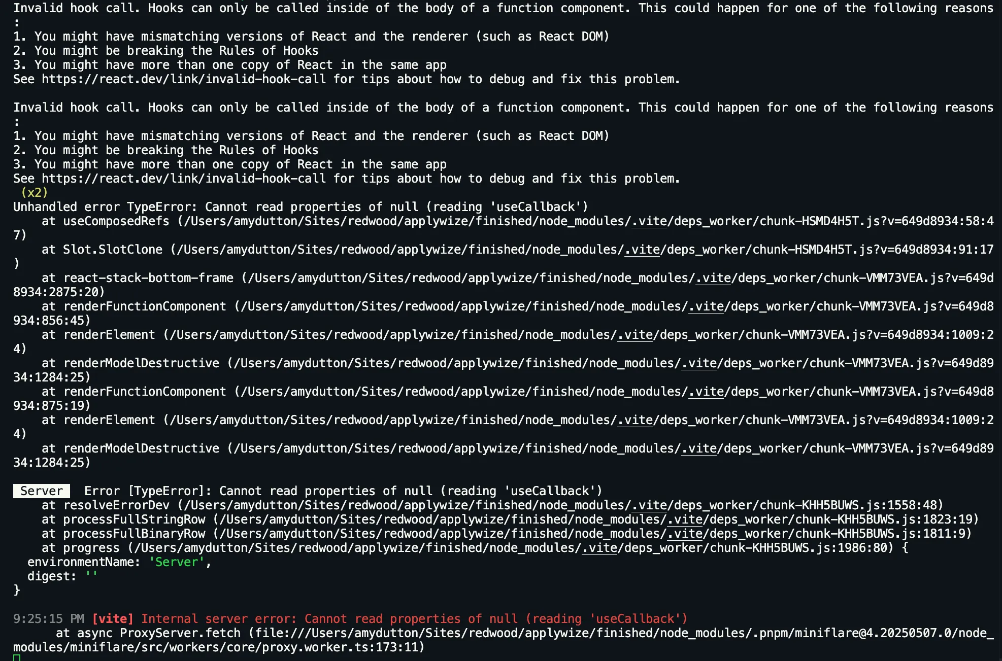
The error is happening because the Slot component from Radix UI (shadcn/ui is built on top of Radix UI) is trying to use hooks in a server component context.
To fix this, open the src/app/components/ui/button.tsx file and add the use client directive to the top of the file:
"use client";You may need to restart the server for this to take effect.
Now, let’s add some styling:
<div className="px-page-side flex justify-between items-center"> <h1 className="page-title">All Applications</h1>- On the wrapping
div, use the custompx-page-sidethat adds20pxof padding to the left and right. - Align the heading and the button with
flex,justify-between, anditems-center. - Use our
page-titleclass to style the heading.
Styling the Applications Table
Section titled “Styling the Applications Table”Now, let’s style the list of applications.
Inside our components directory, let’s create a new file, called ApplicationsTable.tsx.
Directorysrc/
Directoryapp/
Directorycomponents/
- ApplicationsTable.tsx
I’m going to stub out a basic component:
const ApplicationsTable = () => { return ( <div>ApplicationsTable</div> )}
export { ApplicationsTable }Let’s go ahead and put this on our ApplicationsList.tsx page, so we can see the updates we’re making in the browser:
import { ApplicationsTable } from "@/app/components/ApplicationsTable";16 collapsed lines
import { Button } from "@/app/components/ui/button";import { db } from "@/db";
const List = async () => { const applications = await db.application.findMany();
return ( <> <div className="px-page-side flex justify-between items-center"> <h1 className="page-title">All Applications</h1> <div> <Button asChild> <a href="#">New Application</a> </Button> </div> </div> <ApplicationsTable /> <pre>{JSON.stringify(applications, null, 2)}</pre>5 collapsed lines
</> );};
export { List };We’ve already added the shadcn/ui Table component to our project, so let’s go back to our ApplicationsTable.tsx file and use it. Just to start, I’m going to copy the example code from the shadcn/ui documentation and then we can rework it for our needs:
import { Table, TableBody, TableCaption, TableCell, TableHead, TableHeader, TableRow,} from "./ui/table";
const ApplicationsTable = () => { return ( <Table> <TableCaption>A list of your recent invoices.</TableCaption> <TableHeader> <TableRow> <TableHead className="w-[100px]">Invoice</TableHead> <TableHead>Status</TableHead> <TableHead>Method</TableHead> <TableHead className="text-right">Amount</TableHead> </TableRow> </TableHeader> <TableBody> <TableRow> <TableCell className="font-medium">INV001</TableCell> <TableCell>Paid</TableCell> <TableCell>Credit Card</TableCell> <TableCell className="text-right">$250.00</TableCell> </TableRow> </TableBody> </Table> );};
export { ApplicationsTable };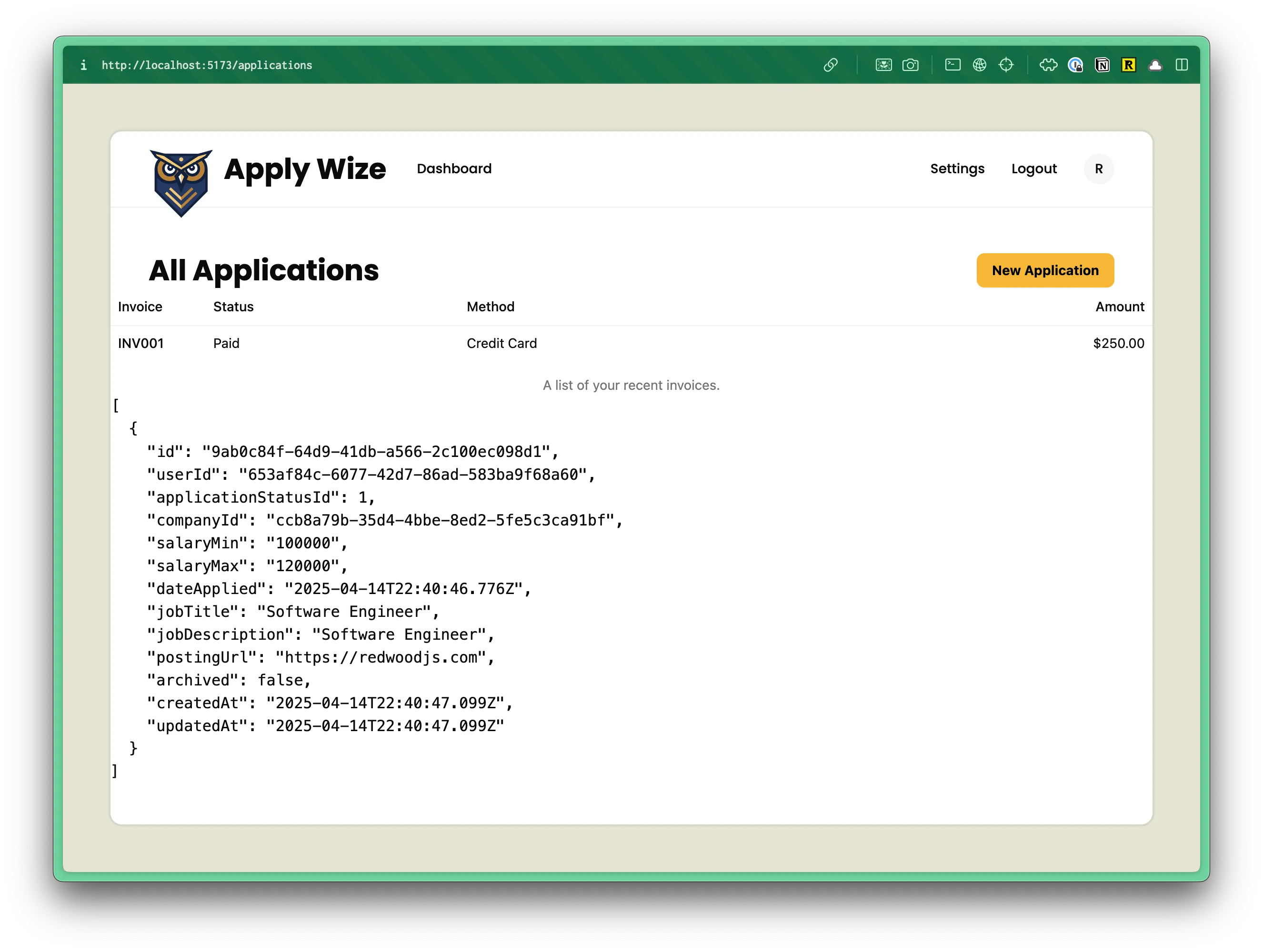
It looks pretty good, but we need to make a few changes to make it work for our data.
First, we can get rid of the TableCaption:
import { Table, TableBody, TableCaption, TableCell, TableHead, TableHeader, TableRow,} from "./ui/table";...<TableCaption>A list of your recent invoices.</TableCaption>Then, I’m going to change the TableHeader to match our design within Figma:
<TableHeader> <TableRow> <TableHead className="w-[100px]">Invoice</TableHead> <TableHead>Status</TableHead> <TableHead>Method</TableHead> <TableHead className="text-right">Amount</TableHead> <TableHead className="w-[100px]">Status</TableHead> <TableHead>Date Applied</TableHead> <TableHead>Job Title</TableHead> <TableHead>Company</TableHead> <TableHead>Contact</TableHead> <TableHead>Salary Range</TableHead> <TableHead></TableHead> </TableRow></TableHeader>- We now have columns for status, date applied, job title, company, contact, and salary range.
- You’ll notice that the last column is empty.
<TableHead></TableHead>Within the table body, this will be our view icon, so this column doesn’t need a heading.
For our TableBody, we need our application data. First, let’s set up our table row, statically. Then, we’ll make it dynamic.
<TableBody> <TableRow> <TableCell className="font-medium">INV001</TableCell> <TableCell>Paid</TableCell> <TableCell>Credit Card</TableCell> <TableCell className="text-right">$250.00</TableCell> <TableCell>New</TableCell> <TableCell>April 15, 2025</TableCell> <TableCell>Software Engineer</TableCell> <TableCell>RedwoodJS</TableCell> <TableCell>John Doe</TableCell> <TableCell>$150,000-$250,000</TableCell> <TableCell> <a href="#">View</a> </TableCell> </TableRow></TableBody>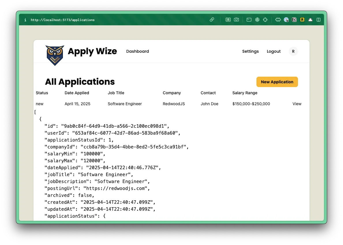
Cool. Let’s make a few stylistic changes before we plug in the data.
Adding Badges to the Status Column
Section titled “Adding Badges to the Status Column”The status column should be a badge. We can reach for the Badge component from shadcn/ui.
import { Badge } from "./ui/badge"...<TableCell> <Badge>New</Badge></TableCell>Within the the Badge component, we’ll need to update the text color:
default: "border-transparent bg-primary text-black text-primary-foreground [a&]:hover:bg-primary/90",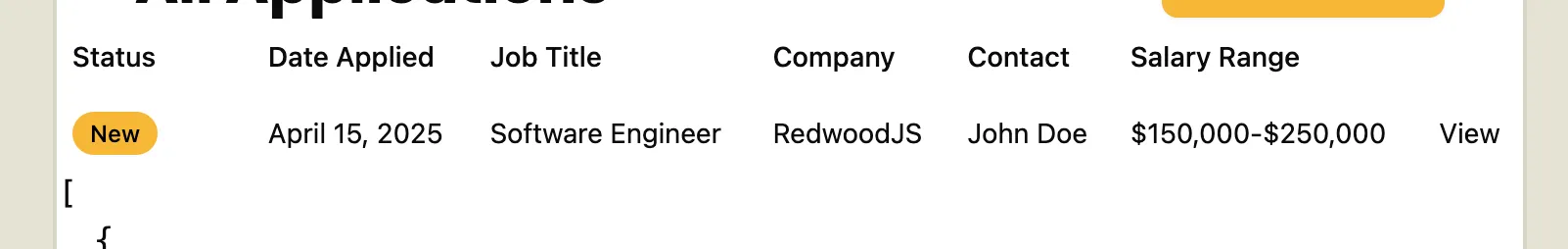
Let’s add some more styles based on the application status. We’ve already added some custom colors to our styles.css file that we can use:
--color-tag-applied: #b1c7c0; --color-tag-interview: #da9b7c; --color-tag-new: #db9a9f; --color-tag-rejected: #e4e3d4; --color-tag-offer: #aae198;Inside of our badge.tsx component, there’s a section near the top called variants. At the following the nested variant object.:
variants: { variant: {8 collapsed lines
default: "border-transparent bg-primary text-primary-foreground [a&]:hover:bg-primary/90", secondary: "border-transparent bg-secondary text-secondary-foreground [a&]:hover:bg-secondary/90", destructive: "border-transparent bg-destructive text-white [a&]:hover:bg-destructive/90 focus-visible:ring-destructive/20 dark:focus-visible:ring-destructive/40 dark:bg-destructive/60", outline: "text-foreground [a&]:hover:bg-accent [a&]:hover:text-accent-foreground", applied: "bg-tag-applied text-black", interview: "bg-tag-interview text-black", new: "bg-tag-new text-black", rejected: "bg-tag-rejected text-black", offer: "bg-tag-offer text-black", },},I added a custom variant for applied, interview, new, rejected, and offer. Now, we can use these variants to style our badges. For example: <Badge variant="new">New</Badge>
While, we’re here, I’m also going to add a few more classes to the default styling:
const badgeVariants = cva( "font-bold inline-flex items-center justify-center rounded-md rounded-full border px-2 py-0.5 text-xs font-medium w-fit whitespace-nowrap shrink-0 [&>svg]:size-3 gap-1 [&>svg]:pointer-events-none focus-visible:border-ring focus-visible:ring-ring/50 focus-visible:ring-[3px] aria-invalid:ring-destructive/20 dark:aria-invalid:ring-destructive/40 aria-invalid:border-destructive transition-[color,box-shadow] overflow-hidden",- Add a font weight of
font-bold. (Be sure to remove thefont-mediumclass, otherwise the two classes will conflict.) - Change the rounded corners from
rounded-mdtorounded-full
Let’s go back to our ApplicationsTable.tsx component and update our badge:
<TableCell><Badge variant="new">New</Badge></TableCell>For the contact column, let’s include an avatar:
<TableCell> <Avatar> <AvatarFallback>J</AvatarFallback> </Avatar> John Doe</TableCell>This is the same avatar component we used in the Header component.
Be sure to import the Avatar and AvatarFallback components at the top of your file:
import { Avatar, AvatarFallback } from "./ui/avatar"Let’s add a few styles to fix the positioning:
<TableCell className="flex items-center gap-2"> <Avatar> <AvatarFallback>J</AvatarFallback> </Avatar> John Doe</TableCell>flexanditems-centeraligns the avatar and name vertically.gap-2adds8pxof padding between the avatar and the name.
Next, let’s replace the “View” text with an SVG icon.
Using an SVG Icon
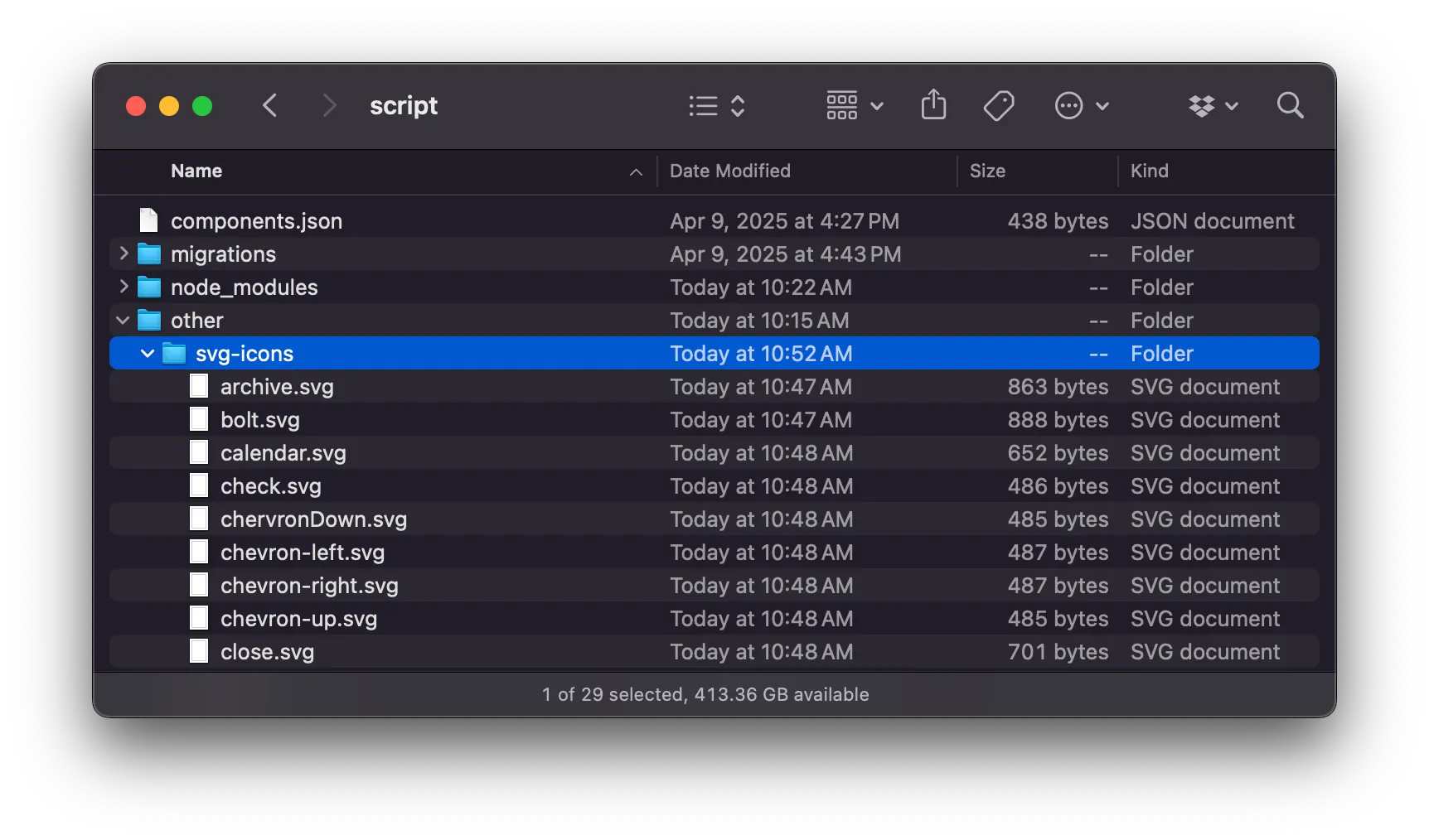
Section titled “Using an SVG Icon”We have several icons we want to use throughout our application. You can export all the SVGs directly from the Figma file, or you can download all of them within this project’s assets directory.
Now, let’s create a new folder in the root of our our project called other and then a sub directory inside that called svg-icons and place all of the icons inside the svg-icons directory.
Directoryother/
Directorysvg-icons/
- …
Directorysrc/
- …
My favorite way to implement SVG icons is through an SVG sprite. This combines all our SVG files into a single sprite.svg file. We can control which icon is displayed by setting the id attribute on the use element.
You could set all of this up, manually, but let’s reach for an npm package to do all the heavy lifting: Lemon Lime SVGs.
Within the Terminal run:
npm i -D lemon-lime-svgspnpm add -D lemon-lime-svgsyarn add -D lemon-lime-svgsOnce installed, run the setup command:
npx lemon-lime-svgs setup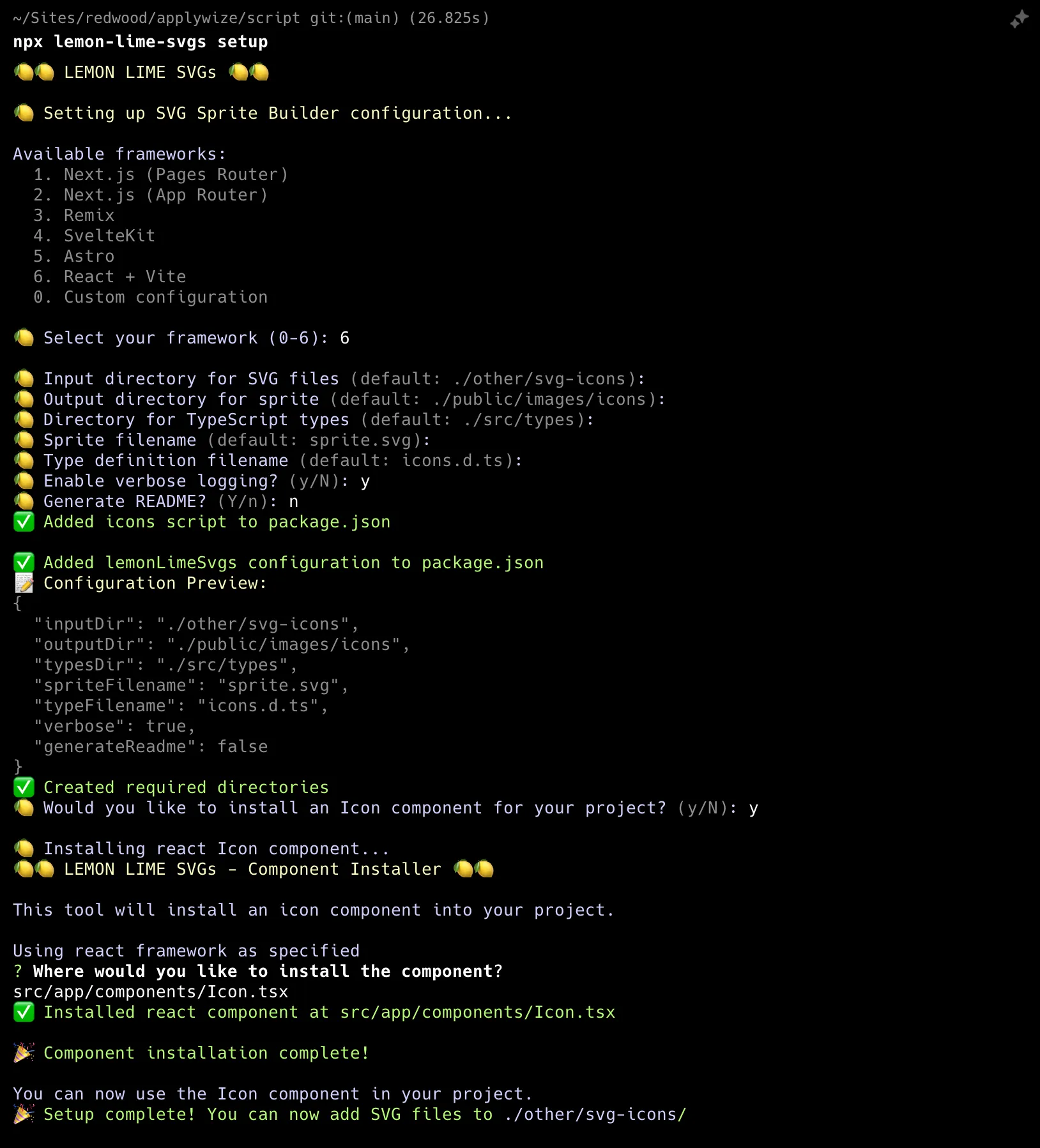
This will ask a series of questions:
- First, it will ask you what framework you’re using. At it’s core RedwoodSDK is React and Vite = 6
- Next, it will ask you about file names and folder paths. It will make recommendations based on the framework you’re using. Most of the defaults, work:
- Input directory for SVG files:
./other/svg-icons— we’ve already set this directory up! - Output directory for sprite:
./public/images/icons - Directory for TypeScript types:
./types— this is different than the default - Sprite file name:
sprite.svg - Type definition file name:
icons.d.ts - Enable verbose logging: The default is set to “no”, but the extra feedback is helpful.
- Set generate a README to no. The default is set to “yes”. The README lives inside the same directory as your sprite and tells future developers that this file was created programmatically. It also provides a list of all the SVG icons available.
- The last prompt asks us if we want to add an Icon component to our project. Say
y. - Then, it will ask us where we want to save our component. We need to veer from the recommendation slightly:
src/app/components/Icon.tsx
- Input directory for SVG files:
- These settings are saved inside your
package.jsonfile, in its own section called,lemonLimeSvgs:package.json "lemonLimeSvgs": {"inputDir": "./other/svg-icons","outputDir": "./public/images/icons","typesDir": "./types","spriteFilename": "sprite.svg","typeFilename": "icons.d.ts","verbose": true,"generateReadme": false} - This script will also create a new
scriptcommand inside yourpackage.jsonfile, calledicons.Once we add the icons to ourpackage.json "icons": "lemon-lime-svgs"svg-iconsfolder, we can generate the sprite using this command:pnpm run icons.
Now, if you look inside your src/app/components directory, you’ll see a new Icon.tsx file.
interface Props { size?: number; id: string; className?: string;}
const Icon = ({ className, size = 24, id }: Props) => { return ( <svg width={size} height={size} className={className}> <use href={`/images/icons/sprite.svg#${id}`}></use> </svg> );};
export default Icon;This component takes
- a
className, if you want to add additional styles to the component - a
size(the default is set to24px) - the
idof the icon you want to display. Theidmatches the file name of the original icon SVG file.
Before we move on, I’m going to change this to a named export to be consistent with the other components we’ve created:
export { Icon }Now, let’s take all our icon SVGs and dump them inside our other/svg-icons directory.
Inside the terminal, let’s generate our sprite:
npx iconspnpm iconsyarn icons
Sweet! Now we can use our Icon component.
Inside our ApplicationsTable.tsx file:
import { Icon } from "./Icon"...<TableCell> <a href="#"> View <Icon id="view" /> </a></TableCell>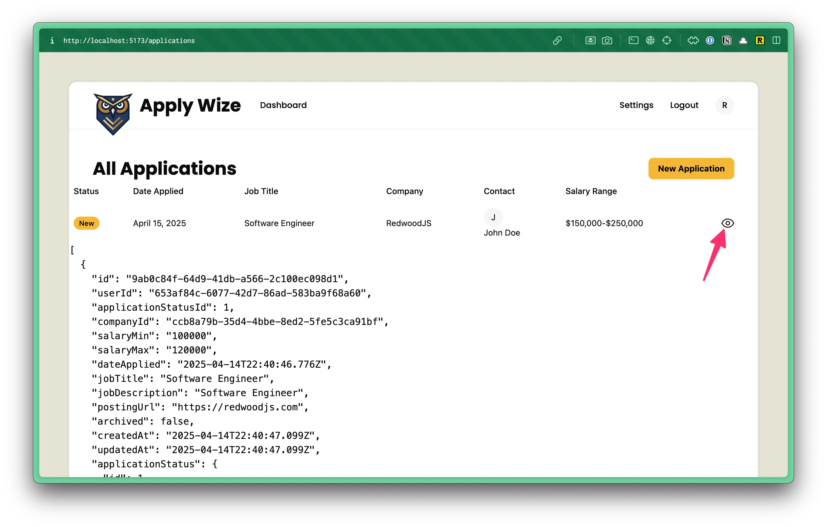
Making our Table Dynamic
Section titled “Making our Table Dynamic”Awesome! Now, let’s make it dynamic. Inside our List.tsx page, let’s pass in all of our application data:
<ApplicationsTable applications={applications} />We already have our applications saved inside a variable called applications, which makes passing in all our data, easy.
When you first set this up, you’ll probably see an error
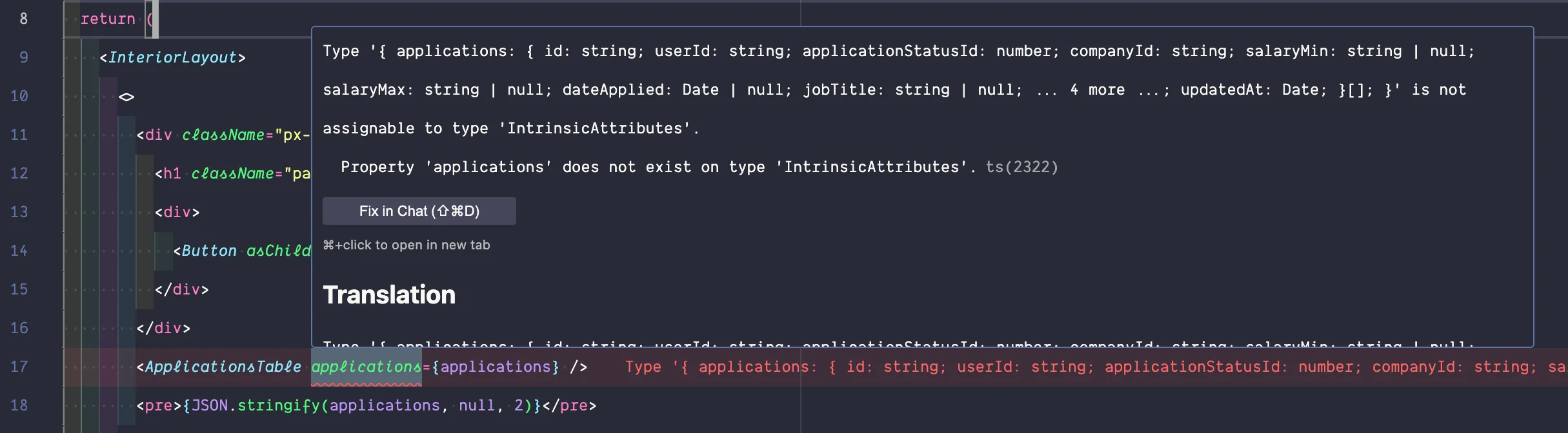
Our component isn’t expecting the applications data we’re passing it. Inside our ApplicationsTable component:
import { Application } from "@generated/prisma";
const ApplicationsTable = ({ applications,}: { applications: Application[];}) => {- Set up the
ApplicationsTablecomponent to receive theapplicationsdata as a prop. - Prisma generates types for us. So, we can import the
Applicationtype from@generated/prisma. Since we’re working with an array of applications, we’ll use square bracketsApplication[].
Now, let’s go down to our TableBody. First we want to loop over all the applications within our applications array and display a row in the table for each:
<TableBody> {applications.map(application => ( <TableRow> <TableCell><Badge>New</Badge></TableCell> <TableCell>April 15, 2025</TableCell> <TableCell>Software Engineer</TableCell> <TableCell>RedwoodJS</TableCell> <TableCell className="flex items-center gap-2"> <Avatar> <AvatarFallback>J</AvatarFallback> </Avatar> John Doe </TableCell> <TableCell>$150,000-$250,000</TableCell> <TableCell> <a href="#"> <Icon id="view" /> </a> </TableCell> </TableRow> ))}</TableBody>We also need to add a key to our TableRow component. This helps React identify which items have changed, been added, or been removed.
<TableRow key={application.id}>Now, we can start replacing the static content with dynamic content.
For our application status and our Badge component, we can swap out the new text with {application.status.status}.
<TableCell> <Badge variant={application.status.status}> {application.status.status} </Badge></TableCell>I’m starting to get an error within my code editor.
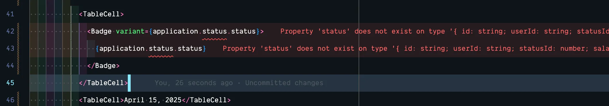
Basically, it’s saying that it’s not aware of the status relationship.
Using Relationships
Section titled “Using Relationships”Let’s go back to our List.tsx file. On line 6, we’re getting all the applications from our table:
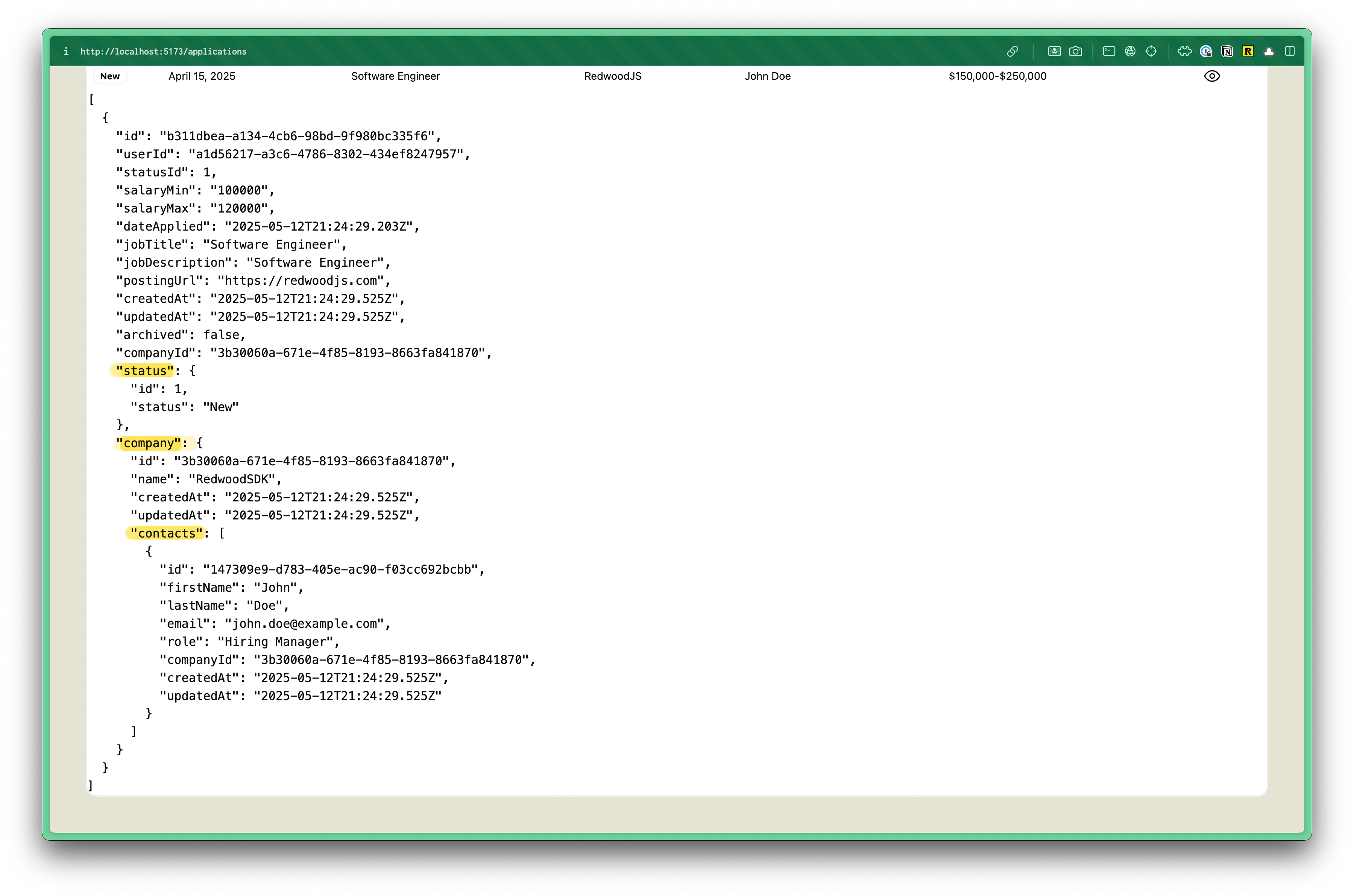
const applications = await db.application.findMany();But, we also need it to include the applicationStatus, company, and contact relationships. Prisma has an easy want to do this using include:
const applications = await db.application.findMany({ include: { status: true, company: { include: { contacts: true } } }});- On line 8 we're telling it to include the
statusrelationship. - On line 9 we're telling it to include the
companyrelationship. - The
contactrelationship is a little different because it's through thecompanyrelationship, but we can continue to drill down, including thecontactsrelationship on line 11.
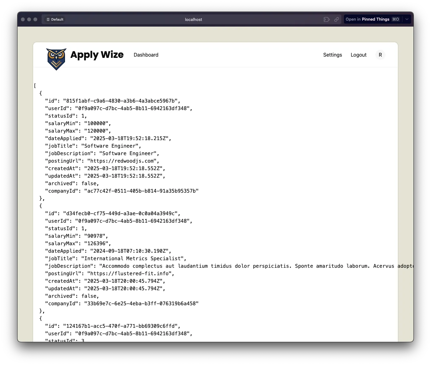
You might need to temporarily comment out the Badge component inside the ApplicationsTable.tsx file, to avoid errors, but if you take a look at the result within the browser, you’ll see the JSON data change shape:
Now, if we go back to our ApplicationsTable.tsx file, the TypeScript error is still there. We’re getting the status information now, but we need to make sure the type is updated to include it as well.
We’re already getting the Application type from @generated/prisma. We need a way to also include the ApplicationStatus, Company, and Contact types.
We could use a TypeScript union to create a new type that has status, company, and contacts. For example:
type ApplicationWithRelations = (Application & { status: ApplicationStatus; company: Company & { contacts: Contact[]; };})[];However, Prisma has a special way to do this.
import { Prisma } from "@generated/prisma"...export type ApplicationWithRelations = Prisma.ApplicationGetPayload<{ include: { status: true, company: { include: { contacts: true } } }}>- With
export type ApplicationWithRelationswe're creating a new type calledApplicationWithRelations, but you could name this whatever you want. - We're
exporting the type so that we can use it in other files. I like to to put this as close to my Prisma query as possible since the type is directly related to the returned data. Then, we can use this type in other components, like theApplicationsTable.tsxfile. Prismais a utility object that we're using to create a new type. This is provided by the Prisma client.ApplicationGetPayloadis a method that takes an object as an argument. The object uses theincludeproperty, to include the data relationships.- Each model has it's own
GetPayloadmethod. Since we're referencing theApplicationmodel, we're usingApplicationGetPayload. But, if we were referencing theCompanymodel, we would useCompanyGetPayload.
- Each model has it's own
At first glance, this looks like more lines of code, but it’s a lot easier to write. When trying to write it by hand with unions (&), you have to determine what the resulting shape of data is. In the second method, Prisma determines the shape of data for us and the include object looks similar to our original Prisma call.
For reference, this was the original Prisma query. You can see that the include object matches the ApplicationGetPayload object exactly:
const applications = await db.application.findMany({ include: { status: true, company: { include: { contacts: true, }, }, },});Awesome. Let’s add our ApplicationWithRelations at the top of our List.tsx file. This goes outside the component definition:
import { Prisma } from "@generated/prisma/client"
export type ApplicationWithRelations = Prisma.ApplicationGetPayload<{ include: { status: true, company: { include: { contacts: true } } }}>
const List = async () => { ...Now, we can use it in our ApplicationsTable.tsx file:
import { Application } from "@generated/prisma";import { ApplicationWithRelations } from "../pages/applications/List";
const ApplicationsTable = ({ applications,}: { applications: ApplicationWithRelations[];}) => {If you look at the TableCell with the status again, you’re probably still seeing an error 🤯
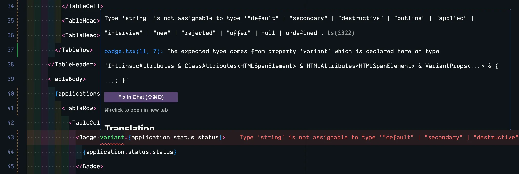
<TableCell> <Badge variant={application.status.status}> {application.status.status} </Badge></TableCell>When we pass in the variant prop for our Badge component, it’s not just looking for a string, it’s looking for a specific string: "default" | "secondary" | "destructive" | "outline" | "applied" | "interview" | "new" | "rejected" | "offer" | null | undefined
Inside our badge component, when we defined our badgeVariants for styles, it uses the variant object to create a type definition. badgeVariants is exported from the badge.tsx component, making it easy to reuse and reference
export { Badge, badgeVariants };Within our ApplicationsTable.tsx:
<Badge variant={ application.status.status.toLowerCase() as VariantProps< typeof badgeVariants >["variant"] }> {application.status.status}</Badge>- On the
application.status.status, we can append.toLowerCase()to ensure the status is formatted correctly and always lowercase. typeof badgeVariants- Gets the type of ourbadgeVariantsfrom thebadge.tsxcomponent.VariantProps<...>- This is a utility type from class-variance-authority library that extracts the prop types. It creates a type that includes all possible variants as properties.['variant']- We reference thevariantobject. In our case, it resolves to the union type:"default" | "secondary" | "destructive" | "outline" | "applied" | "interview" | "new" | "rejected" | "offer" | null | undefined
At the top of the ApplicationsTable.tsx file, be sure to update your imports:
import { Badge, badgeVariants } from "./ui/badge";import { VariantProps } from "class-variance-authority";Sweet! Now, all of our TypeScript errors should be taken care of.
Let’s keep making our data dynamic.
<TableCell> April 15, 2025 {application.dateApplied?.toLocaleDateString('en-US', { year: 'numeric', month: 'long', day: 'numeric' })}</TableCell>For the date, we can use the application.dateApplied property. Then, we can format the date using the toLocaleDateString JavaScript method. For more options, see MDN's Date.prototype.toLocaleDateString documentation.
For the job title:
<TableCell> Software Engineer {application.jobTitle}</TableCell>For the company name:
<TableCell> RedwoodJS {application.company.name}</TableCell>For the contact name, we’re just going to reference the first character in the first name within our contacts array.
<TableCell className="flex items-center gap-2"> <Avatar> <AvatarFallback>J</AvatarFallback> <AvatarFallback>{application.company.contacts[0].firstName.charAt(0).toUpperCase()}</AvatarFallback> </Avatar> John Doe {application.company.contacts[0].firstName} {application.company.contacts[0].lastName}</TableCell>For the salary range:
<TableCell> $150,000-$250,000 {application.salaryMin}-{application.salaryMax}</TableCell>For the view link:
<TableCell> <a href="#"> <a href={link("/applications/:id", { id: application.id })}> <Icon id="view" /> </a></TableCell>Be sure to import link at the top of the file:
import { link } from "../shared/links";You’ll probably see another error.
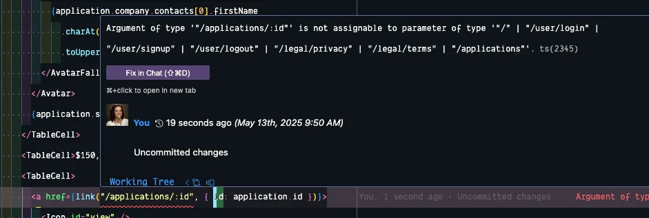
We need to do a little more setup to make this work.
In our worker.tsx file, let’s add our route:
layout( InteriorLayout, prefix("/applications", [ isAuthenticated, route("/", List), route("/:id", () => <h1>Application</h1>), ])),- The wrapping
layoutfunction ensures that theInteriorLayoutcomponent is applied to our route. - We can nest our
routedefinition within the applicationsprefix. - The
:designates that our route is dynamic and contains theidin the URL. - Since the
isAuthenticatedfunction is listed first within the array, our route is protected. - Temporarily, we'll display an
<h1>with the text "Application".
Now, let’s jump over to shared/links.ts file and add /applications/:id to our array:
export const link = defineLinks([7 collapsed lines
"/", "/user/login", "/user/signup", "/user/logout", "/legal/privacy", "/legal/terms", "/applications", "/applications/:id",]);Perfect. Everything should check out. Try clicking on the view icon in the browser. You should be redirected to a page with an “Application” heading.
Final ApplicationsTable.tsx file
import { Badge, badgeVariants } from "./ui/badge";import { Table, TableBody, TableCell, TableHead, TableHeader, TableRow,} from "./ui/table";import { Avatar, AvatarFallback } from "./ui/avatar";import { Icon } from "./Icon";import { ApplicationWithRelations } from "@/app/pages/applications/List";import { VariantProps } from "class-variance-authority";import { link } from "../shared/links";
const ApplicationsTable = ({ applications,}: { applications: ApplicationWithRelations[];}) => { return ( <Table> <TableHeader> <TableRow> <TableHead className="w-[100px]">Status</TableHead> <TableHead>Date Applied</TableHead> <TableHead>Job Title</TableHead> <TableHead>Company</TableHead> <TableHead>Contact</TableHead> <TableHead>Salary Range</TableHead> <TableHead></TableHead> </TableRow> </TableHeader> <TableBody> {applications.map((application) => ( <TableRow key={application.id}> <TableCell> <Badge variant={ application.status.status.toLowerCase() as VariantProps< typeof badgeVariants >["variant"] } > {application.status.status} </Badge> </TableCell> <TableCell> {application.dateApplied?.toLocaleDateString("en-US", { year: "numeric", month: "long", day: "numeric", })} </TableCell> <TableCell>{application.jobTitle}</TableCell> <TableCell>{application.company.name}</TableCell> <TableCell className="flex items-center gap-2"> <Avatar> <AvatarFallback> {application.company.contacts[0].firstName .charAt(0) .toUpperCase()} </AvatarFallback> </Avatar> {application.company.contacts[0].firstName}{" "} {application.company.contacts[0].lastName} </TableCell> <TableCell> {application.salaryMin}-{application.salaryMax} </TableCell> <TableCell> <a href={link("/applications/:id", { id: application.id })}> <Icon id="view" /> </a> </TableCell> </TableRow> ))} </TableBody> </Table> );};
export { ApplicationsTable };Finalizing the List Page
Section titled “Finalizing the List Page”Now, let’s go back to our List.tsx and tidy up a few things.
On line 40, we can remove our JSON.stringify function:
<pre>{JSON.stringify(applications, null, 2)}</pre>Below our table, let’s add a couple of buttons. An “Archive” button on the left and another “New Application” button on the right:
<ApplicationsTable applications={applications} /><div className="flex justify-between items-center"> <Button asChild variant="secondary"> <a href="#"> <Icon id="archive" /> Archive </a> </Button> <Button asChild> <a href="#"> <Icon id="plus" /> New Application </a> </Button></div>- The classes
flex justify-between items-centeron the wrappingdivposition our buttons. - On the first button, I've added a
variant="secondary"which will make the button a light beige. - I also included the
archiveicon next to the archive text:<Icon id="archive" /> - On the "New Application" button, I added the
plusicon:<Icon id="plus" />
You’ll also need to import the Icon component at the top of the file:
import { Icon } from "@/app/components/Icon";If you look at this within the browser, we’re getting closer:
The Archive button should link to a filtered view of all applications that have been archived. Let’s update our link:
<a href={`${link("/applications")}?status=archived`}> <Icon id="archive" /> Archive</a>Be sure to import the link object at the top of the file:
import { link } from "@/app/shared/links";This is really a filtered view of our existing /applications page, so we can use the existing /applications link. Then, we’re appending the query parameter: ?status=archived. We don’t need to do anything extra to make this link work, but we do need to adjust our List page to account for the status query parameter. We’ll come back to this!
For the New Application button, let’s update the href:
<Button asChild> <a href={link("/applications/new")}> <Icon id="plus" /> New Application </a></Button>/applications/new doesn’t exist yet. We need to set up this page. In our worker.tsx file, let’s add a new route:
layout( InteriorLayout, prefix("/applications", [ isAuthenticated, route("/", List), route("/new", () => <h1>New Application</h1>), route("/:id", () => <h1>Application</h1>), ]) ),- We can nest our
routedefinition within the applicationsprefix. - Temporarily, we'll display an
<h1>with the text "New Application".
Now, let’s add our link to the links.ts file:
export const link = defineLinks([7 collapsed lines
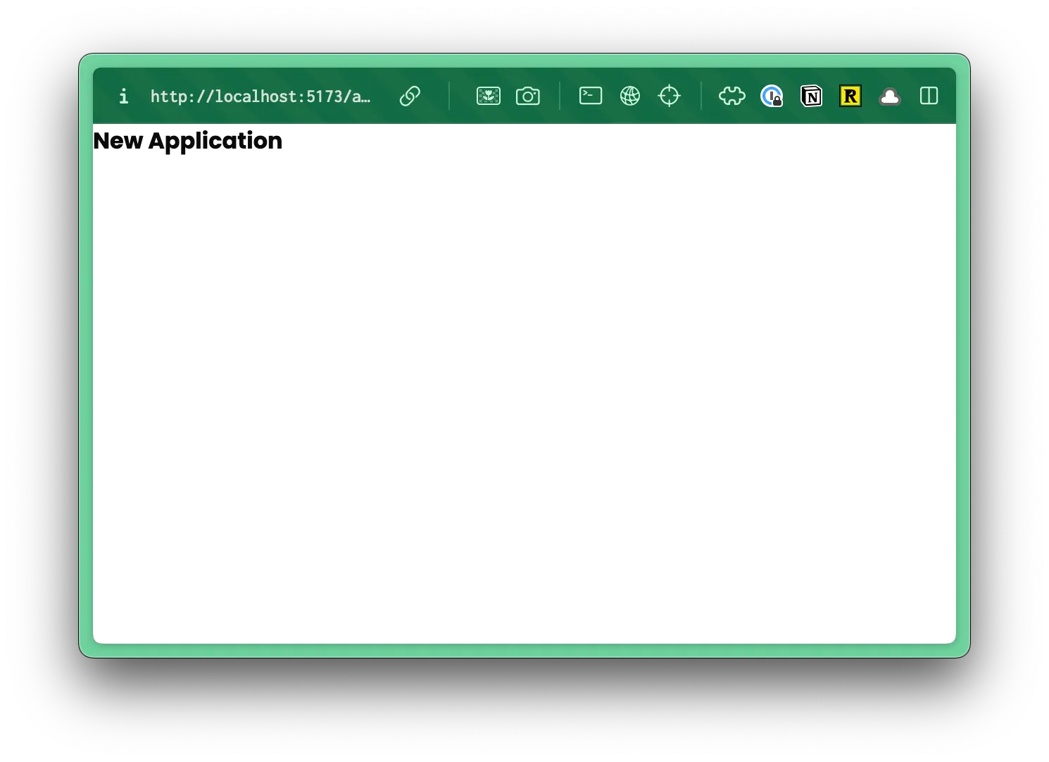
"/", "/user/login", "/user/signup", "/user/logout", "/legal/privacy", "/legal/terms", "/applications", "/applications/new", "/applications/:id",]);If we test this out within the browser, clicking on the “New Application” button at the bottom, you should see our temporary “New Application” page:
Let’s make the “New Application” button at the top, match the button at the bottom.
return ( <> <div className="px-page-side flex justify-between items-center"> <h1 className="page-title">All Applications</h1> <div> <Button asChild> <a href={link("/applications/new")}> <Icon id="plus" /> New Application </a> </Button> </div> </div> <ApplicationsTable applications={applications} /> <div className="flex justify-between items-center"> <Button asChild variant="secondary"> <a href={`${link("/applications")}?status=archived`}> <Icon id="archive" /> Archive </a> </Button> <Button asChild> <a href={link("/applications/new")}> <Icon id="plus" /> New Application </a> </Button> </div> </>);Now, let’s adjust the spacing around our table. On line 31, we’re using a class of px-page-side to add some padding to the left and right side.
return ( <> <div className="px-page-side flex justify-between items-center">Let’s remove this from the div and add it to a wrapping div.
return ( <> <div className="px-page-side">26 collapsed lines
<div className="flex justify-between items-center"> <h1 className="page-title">All Applications</h1> <div> <Button asChild> <a href={link("/applications/new")}> <Icon id="plus" /> New Application </a> </Button> </div> </div> <ApplicationsTable applications={applications} /> <div className="flex justify-between items-center"> <Button asChild variant="secondary"> <a href={`${link("/applications")}?status=archived`}> <Icon id="archive" /> Archive </a> </Button> <Button asChild> <a href={link("/applications/new")}> <Icon id="plus" /> New Application </a> </Button> </div> </div> </>);- You'll notice, we converted the React Fragment
<>to adivand added a class ofpx-page-sideto it.
Before we preview this in the browser, let’s adjust the vertical spacing.
return ( <div className="px-page-side"> <div className="flex justify-between items-center mb-5">9 collapsed lines
<h1 className="page-title">All Applications</h1> <div> <Button asChild> <a href={link("/applications/new")}> <Icon id="plus" /> New Application </a> </Button> </div> </div> <div className="mb-8"> <ApplicationsTable applications={applications} /> </div> <div className="flex justify-between items-center mb-10">- On line 33, I added
mb-5for20pxof margin on the bottom. - On line 44, I added
mb-8for32pxof margin on the bottom. - On line 47, I added
mb-10for40pxof margin on the bottom.
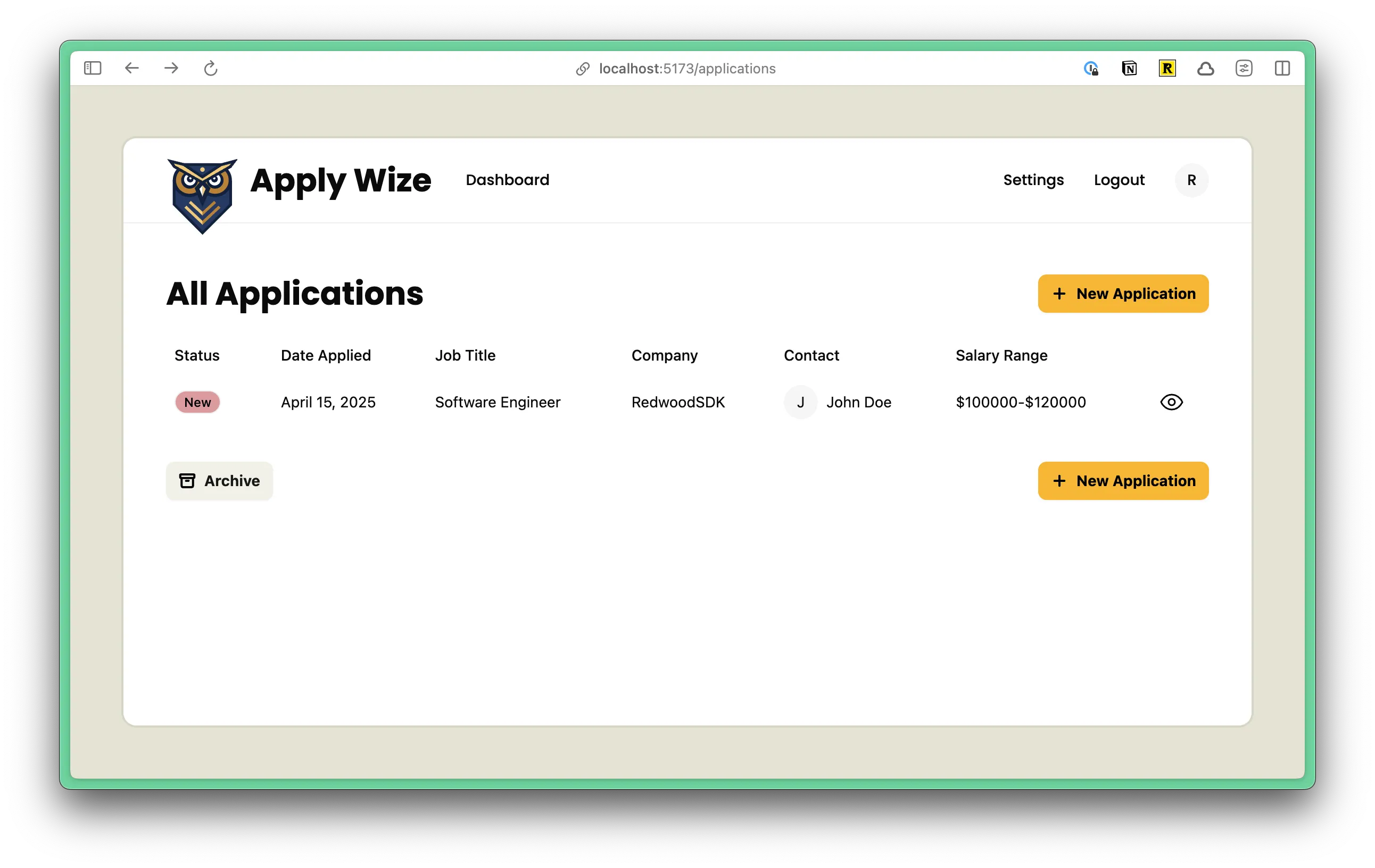
Now, let’s preview this in the browser:
Before we call this done, let’s ensure that our Archive filter is working.
Using Query Params to Filter Applications
Section titled “Using Query Params to Filter Applications”On every page we get an object that contains ctx, request, and headers. In our case, the request contains the query parameters that we’re looking for.
On List.tsx, when we define our List function, let’s accept request as a prop:
const List = async ({ request }: { request: Request }) => {You'll notice that request, has a standard Request type.
Now, at the top of our function, we can get the status query parameter using the URLSearchParams method from the standard WebAPI:
const List = async ({ request }: { request: Request }) => { const url = new URL(request.url); const status = url.searchParams.get("status");
console.log({ status });If you run this in the browser, you should see { status: 'archived' } displayed in the terminal.

Now, that we’ve checked that our query parameter is working, we can remove our console.log statement and adjust our Prisma findMany query.
After the include object, let’s add a where object:
const applications = await db.application.findMany({ include: { status: true, company: { include: { contacts: true, }, }, }, where: { archived: status === "archived" ? true : false, },});The where clause filters the results of our query based on whether the status is archived.
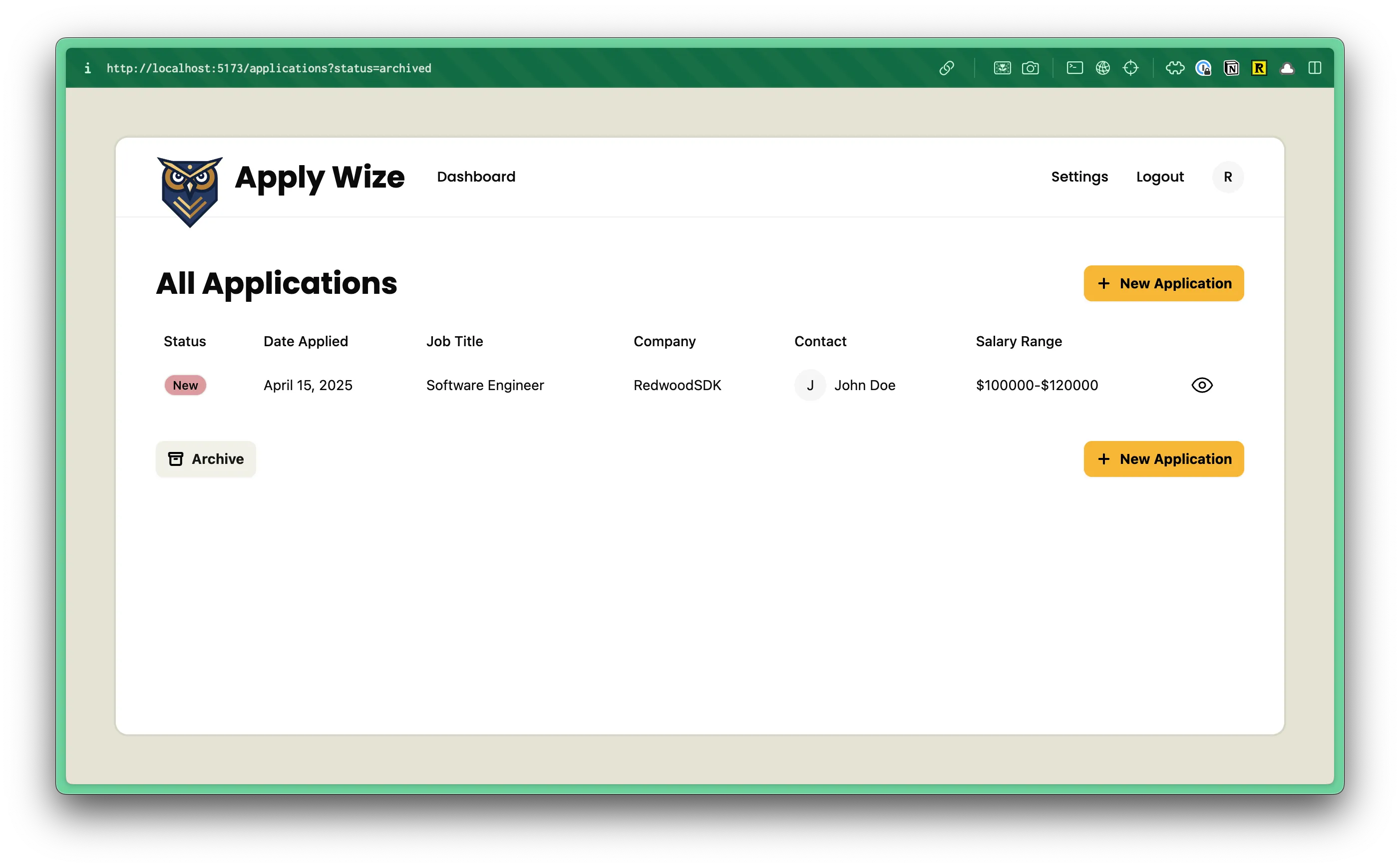
You can test this in the browser, by clicking on the Archive button. You should see the URL change to include /applications?status=archived and the entry applications table should be empty.
Let’s make this better by adding an empty state:
<div className="mb-8"> {applications.length > 0 ? ( <ApplicationsTable applications={applications} /> ) : ( <div className="text-center text-sm text-muted-foreground"> No applications found </div> )}</div>- On line 53, we're checking if the
applicationsarray has more than one item. If it does, display theApplicationsTable. - If it doesn't, display a message that says "No applications were found."
- Add a few styles to our message:
- Centered with
text-center - Reduced the text size with
text-sm - Changed the text color to
text-muted-foreground
- Centered with
Once we click on the “Archive” button, it’s easy to feel “stuck”. We’re showing all the archived applications, but there’s not an easy way to see all the active applications again.
Let’s change the “Archive” button so that it toggles based on the query parameter.
<Button asChild variant="secondary"> {status === "archived" ? ( <a href={`${link("/applications")}`}> <Icon id="archive" /> Active </a> ) : ( <a href={`${link("/applications")}?status=archived`}> <Icon id="archive" /> Archive </a> )}</Button>- If the
statusis equal toarchivedthen the link should go to/applicationsand the button label should beActive. - Otherwise, display the
Archivebutton, with the query parameter?status=archived
Test it out in the browser:
It looks and works great!
Remember, you can use Prisma Studio to add more seed data, if you want to test various states.